

📊 My 3-Level Execution Tracker: How I Plan Projects, Programs & Org Goals
A real-world system to bring clarity and momentum—without adding more dashboards

🚧 The Real Problem Most Teams Face
You know the feeling. You're in a meeting on Monday. A project sounds urgent. Everyone agrees it's important. Then comes next Monday—no one knows what actually happened. Some parts moved, others didn’t. People are still "figuring it out."
It’s not that people don’t care. It’s that execution gets blurred when we treat every initiative, goal, and cross-functional ask the same way. We dump them all in one deck or dashboard and hope the system will carry the work forward.
As Chief of Staff at Rebel Foods, I saw this happening across departments. And I was the one trying to track it all.
So, I built something simple: a 3-level execution tracker. It helped me – and the teams I support – create separation between different types of work, apply the right cadence, and get clarity on where things were actually moving.
This post walks you through that system, shows you how I use it in practice, and gives you a downloadable template to adapt for your own org.
🧹 Why a 3-Level System?
Work happens at different levels. But most tracking systems lump everything together. The result? Execution gets flattened. A big bet from the CEO is tracked the same way as a quick CX experiment.
You need altitude. You need rhythm. You need ownership clarity.
That’s what the 3-level tracker gives you:
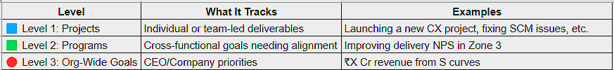
🔍 Think of this like Google Maps zoom: Level 1 is street view, Level 2 is neighborhood, Level 3 is the whole city.
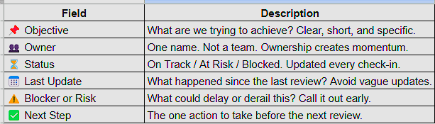
📂 The Template: What It Tracks
Every level in the tracker uses the same fields. It brings a sense of uniformity without over-engineering it.
Want to try it? 📂 Download the Tracker Template (Google Sheet)
🗓️ Cadence: When I Use Each Level
Tracking only works when it matches your org's rhythm. Here's what works for me:
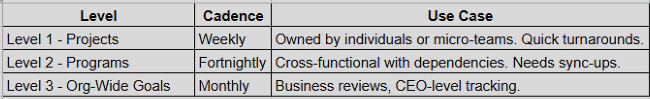
⌚️ Never review all 3 levels together. It creates noise. Separate them.
📚 How I Use It (Real Examples)
Let’s say the CEO wants additional revenue of Rs. 200 crores from S-curves
Level 3: “Increase revenue by Rs. 200 crores with S curves” (Org-Wide Goal)
Level 2: A Program to introduce Concierge services for High Value Orders
Level 1: A Project to reduce Returns by 50%
Each of these has its own owner, check-in, and status. We color code the rows:
🟢 Green = On Track
🟡 Yellow = At Risk
🔴 Red = Blocked
It helps us answer: What’s truly stuck? What needs a nudge? Where do we focus?
🌈 Visualizing It
You can visualize this in a Google Sheet like this: (Fictional project details and objectives below)
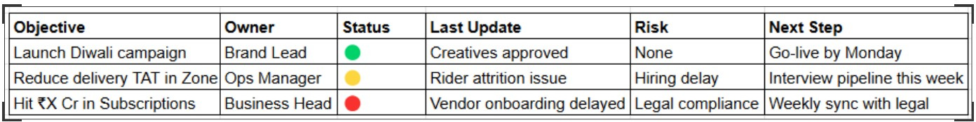
🎨 You can use emojis, color highlights, or Notion board views to make it visual and intuitive.
📁 Pro Tips That Made It Stick
Add Tags like
#CX,#Revenue,#Growthto filter easilyLink to Docs or meeting notes inside the tracker
Keep it real: If nothing moved, write that. No jargon.
🧠 What Changed After I Started Using This
I stopped chasing teams for updates, and project updates / Action Items from last meetings are discussed at the start of every meeting
Review meetings became decision-making Sprint meetings
CEO visibility improved—without a separate dashboard
This system won’t solve everything. But it’s a start. It meets people where they are: in the middle of the work.
✉️ Want More Tools Like This?
I’ll be sharing more such templates, playbooks, and behind-the-scenes lessons in Business Beyond Obvious.
If you liked this, forward it to someone who’s navigating chaos in a growing org.